We believe this rebranding is a stepping stone in our journey in keeping our customers and partners safe from cyber attacks every day.
Re-examining our voice and values
We have already built a reputation, and we felt it was time to take our brand to the next level. Whilst we had a strong existing identity, we ultimately felt that we could adopt a new look-and-feel to better reflect who we are and make it more precise in reflecting our brand values and more cohesive with our product.
As we don’t provide only technology but a complete solution that includes unique technology alongside comprehensive service, it was essential for us to be precise in our identity and our values.
To do so, during the branding process, we decided to highlight the following design pillars that reflect our vision and aspiration. They are agility, speed, modern, clean, seamless, advanced, and of course—excellent.
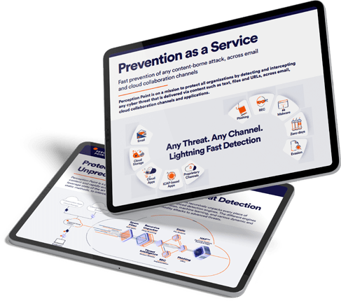
These messages, together with our proven ability to provide better prevention, allowed us to coin a new term that encapsulated all of the above in 4 words (or one phrase), “Prevention-as-a-Service.”
Our first major change
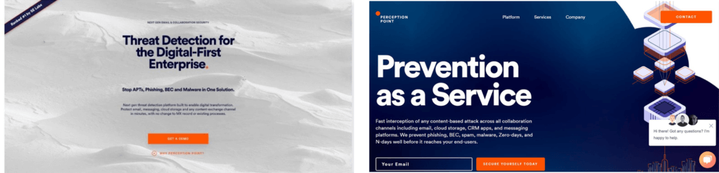
We replaced our core message from “Threat Detection for the Digital-First Enterprise” to “Prevention-as-a-Service.” We wanted to reiterate that we not only detect threats—we intercept them.
Designing the new website
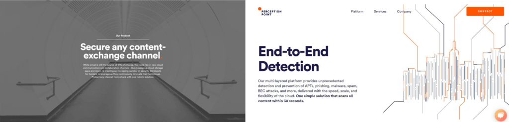
We changed our main message to make it more approachable for any visitor looking to learn about content-based security in general. Therefore, we divided the platform tab in the menu bar into two sections: by threats and by channels. We, of course, linked them to each other as they are highly connected.
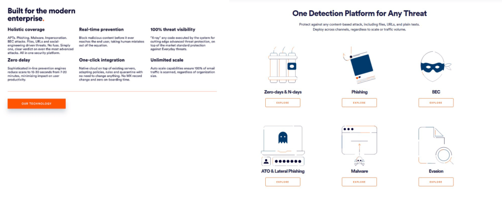
Each one of the tabs has its threat and the component in our system that protects against it. Each tab starts with a full explanation about the threat/channel that needs protection. Then we provided examples, case studies, and blogs relevant to each subject.
To ensure all was clear, we gave much more emphasis to the content we produced. We expanded our blog to include more topics, and we have started to share our Research and Incident Response Teams’ knowledge. We gave it a lot of space on each tab and on each page so people will know where to look and to benefit from it.
Visual Identity
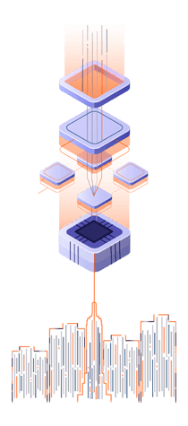
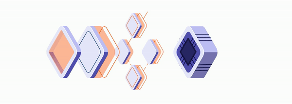
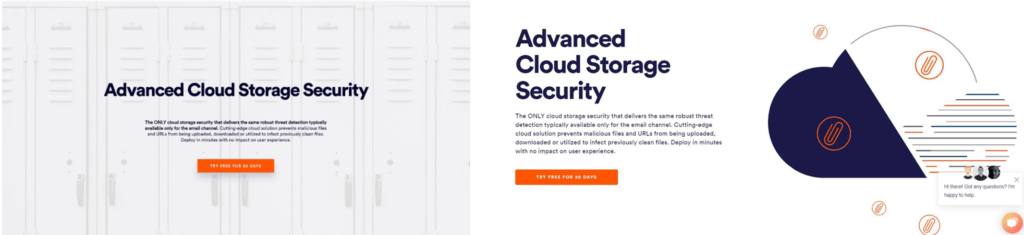
The goal was to give a visual expression of our values and showcase them in a clear way. We had to think of a way to emphasize that we protect content across all channels. We wanted to explain that information travels everywhere in a fast and seamless manner.
We chose to use the Morse code theme—which shows that content travels between places, everywhere and anywhere. It also shows this is the core of any organization—without communication, there’s no business. We’re here to protect that connectivity.
We translated our design identity into two styles. One for our platform and services, and the second for the threats we’re facing. One is strong, solid, and futuristic while the other one is dynamic and fast.
Our Style
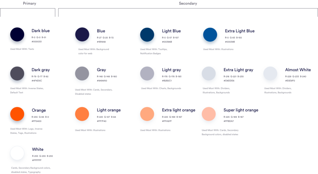
Style-wise, we decided to go for a minimalist and modern feeling, which correlates with our technology approach. For this theme, we choose a clean, clear color for our backgrounds instead of the gray color used until that point.
This small change created a significant difference between the two versions of our brand. It allowed us to highlight key points using a more stylish orange and blue colors where needed.
We also wanted our palette to feel vibrant and fresh while staying true to the original brand colors. We expanded the color palette to more shades of blue, orange, and gray adding more ”life” into our design world. You know, the world is not black and white – it’s also gray, blue, and orange – just look at the sunrise and dawn.
Brand storyboarding
We began the extensive work by immersing ourselves in what we have already achieved and what our plans are moving forwards.
We then discussed how our services help people to ‘level-up’ in their work—not only in relation to their security status, but also their user experience, ability to drive growth, improve relations with customers and meet scan – and the advantages it gives us over our competitors.
We went on to define our values. These would go on to form the core of our personality and act as a basecamp we could circle back to for each brand decision that we make. They are the following:
- Agility. Cybersecurity is an ever-evolving business. As attackers keep on innovating, so should the defenders. We look to provide agile and quick-to-response service to our customers and partners.
- Speed. We do everything much quicker than any other vendor out there. We scan faster, we provide verdict faster, and we act faster to meet our clients’ needs.
- Modern. As a native to the cloud, we want the world to see that we are truly built for today’s (and tomorrow’s) enterprise.
- Clean. Simple, neat and to the point. This is how we communicate with our stakeholders. No fluff, no buzz-words.
- Seamless. Deployed without any fuss, integration and deployment create zero overhead for IT teams.
- Advanced technology. We have developed next-gen technology that outperforms any other competitor. We use 7 layers to ensure no content-based attack successfully hits our customers.
- Excellence. We don’t do things halfway. If there’s a problem or gap, we will close it and make sure everything works perfectly. There’s no cutting corners, just pure aspiration for perfection.
So, what does Prevention-as-a-Service mean?
We based the term on two main pillars. The first is that we are here to prevent attacks—well before they reach the end-user—and not only detect them. This is an essential part of our technology. We provide scale and speed. This allows us to stand between the attacker and the targeted employee and not stand on the side waiting for the coming attacks.The second is that we are here to build relationships with our customers and partners. We provide many services in one solution.
These include the following:
- Incident Response teams that monitor and track each incident
- End-user reporting
- Ongoing customer relations
Wrapping it up
We wanted to highlight our approach of delivering an ongoing service that evolves and improves for the benefit of the customer. In addition, we wanted to show the world that we’ve matured significantly. It’s pretty unique that a small Israeli startup has developed into a market leader in its domain.
We also wanted to show the agility of our solution. By adopting a new look and language, we’ve shown our ability to adapt and interact smoothly with our stakeholders across multiple touch points.
As a lean team we knew that a full rebranding was going to be a stretch, but if we were ever going to do it, now was the time. Our mission had many goals: unify the company around one common brand story, form stronger connections with our audience and provide a solid foundation for future growth.
We believe we achieved that in our new design. What do you think? Let us know your thoughts here.